Finance
Finance: applications of statistics, making chocolate, consumption of chocolate in Australia, 1 and 2 cent coins.
CHOCOLATE PRODUCTION AND CONSUMPTION IN AUSTRALIA
What sort of patterns would you expect to see in the production of consumer goods?

For example, consider chocolate production in Australia from July 1957 to August 1995.
The production for the first six months of this time period was:
| Year | Month | Production (tonnes) |
|---|---|---|
| 1957 | July | 2953 |
| 1957 | August | 2635 |
| 1957 | September | 2404 |
| 1957 | October | 2413 |
| 1957 | November | 2136 |
| 1957 | December | 1565 |
Here's a graph of the full data set:
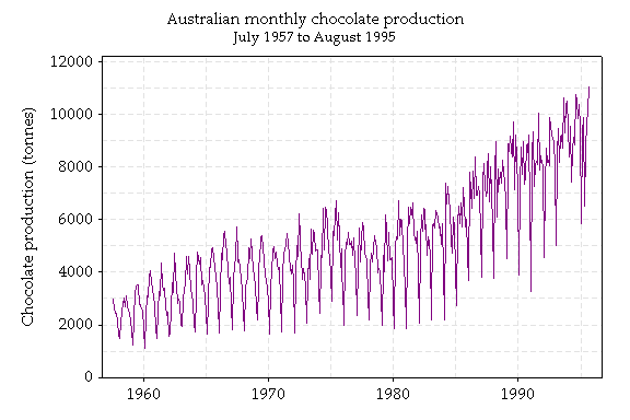
There seems to be some patterns in the production of chocolate. Is this what you would expect?
When do the peaks occur? What about the downward spikes?
Why do you think this is?
We could also consider the change from month to month. Here are some graphs of the changes.
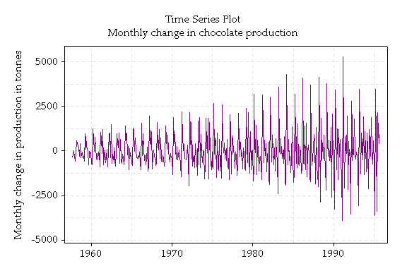
The graph above is a simple time series graph of the changes in chocolate production over time. The change in production from month to month is not well modelled with a single normal distribution, because the variance is increasing with time. As the production increases, it varies by more.
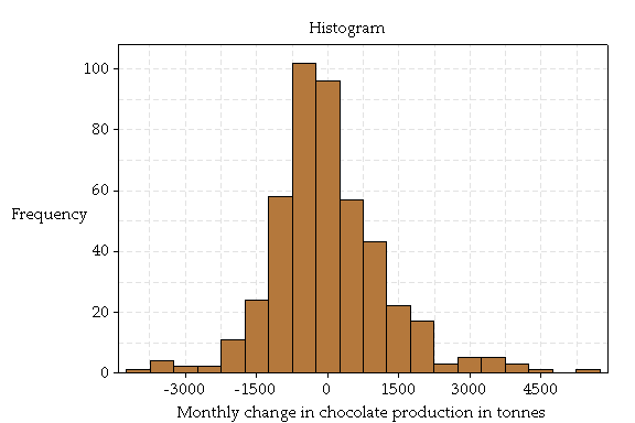
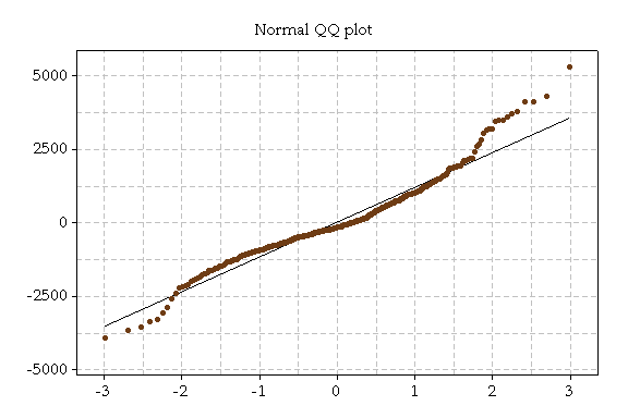
The graph above is a histogram of these changes and the graph below is a Normal QQ plot of these changes. A QQ plot is a graphical method of deciding if a sample of values—in this case the 457 changes in production—are normally distributed. It plots the ordered values against quantiles of the standard normal. A straight line indicates a fairly normal distribution, which is not observed in this case.
Do you think the upward trend in production indicates that Australians were consuming more chocolate in 1990 than in, say, 1980?
Here are some graphs to help think about that question:
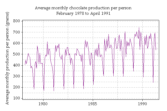
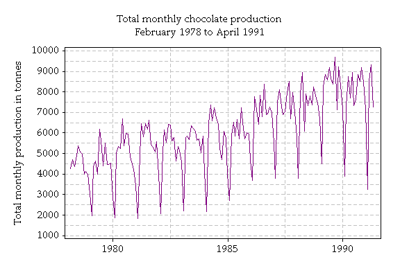
These graphs show information about chocolate production from 1978 to 1991. The total monthly production is shown in tonnes, and the average monthly production is in grams. Production per person peaks at over 700 grams in 1989.
There is an increase in production over time; however the increase do not appear so marked when we take population size into account.
THE EFFECT OF ELIMINATING 1 AND 2 CENT COINS
In 1994 1 and 2 cent coins were taken out of circulation in Australia. Today all hard cash transactions are rounded to the nearest 5 cents. Should shopkeepers be worried
about losing a lot of money due to rounding?
What are the effects on shopkeepers?
As an example, consider a shopkeeper after 1000 transactions (about 50 per day for a month of 20 trading days).Rounding to the nearest 5 cents, any given shopkeeper will expect to break even.However, some will make a bit and some will lose a bit.
What is a range within which 95% of shopkeepers will be after 1000 transactions? Bear in mind, the most unlucky shopkeeper would lose 2 cents on each transaction, for a total of $20.
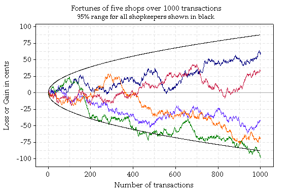
This graph shows the fortunes over time of 5 shopkeepers (each in a different colour) as simulated by a computer. The curved black line shows the 95% range for all shopkeepers.
Very surprisingly, 95% of shopkeepers will gain or lose no more than 88 cents in 1000 transactions. Only 1.15% of shopkeepers (one in 87) will lose more than $1 in 1000 transactions, and 0.06% (four in 10,000) will lose more than $1.50. These results are found using the "Central Limit Theorem", a key result in probability.
What are the effects on large supermarkets?
Should large supermarkets that do, say, one transaction each minute, 12 hours a day, 7 days a week, 365 days a year, for a total of 262,800 transactions in a year worry about losing a lot of money?
Even though losing two cents on each transaction would give a loss of $5256, 95% of such large stores will be within $14.21 of breaking even at the end of the year! The 95% range grows slowly, as the square root of the number of transactions. So, for example, after 100,000 transactions the 95% range doesn't increase to $88 from 88 cents (100 times 88 cents) but rather to $8.80.