Science
Science: applications of statistics in the following topics, clover leaves, fire-fighters, family heights, Melbourne weather, german tanks in WW2.
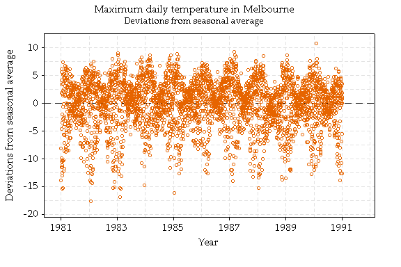
PATTERNS IN MELBOURNE'S TEMPERATURES
Melbourne weather is notoriously unpredictable, but there are still many patterns, some obvious and some not so obvious. Here we look at daily temperatures in Melbourne for the ten year period 1981-1990.
First, think about the minimum daily temperature.
What do you expect it to look like?
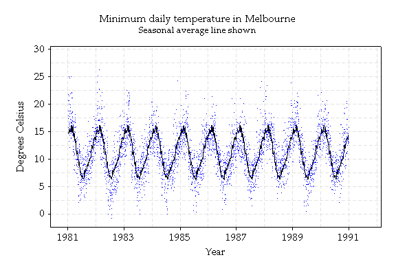
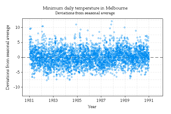
Obviously, minimum temperatures are warmer in summer than in winter. To quantify this (which would be useful for, say, tourism brochures), a smooth line representing the seasonal average minimum is shown. This line was computed by taking the average temperature for each day of the year, averaging over the 5 years shown, and then taking 'moving averages' or averages of groups of successive days. The more days averaged, the smoother the line. The lower graph shows deviations from the seasonal average.
There are other patterns that are not so obvious. For instance, is there a tendency for a warm minimum to be followed by another warm minimum?
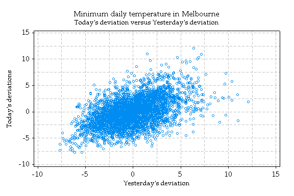
To investigate this question, the deviations from the seasonal average line were graphed as above. The suspected pattern can be seen by the upward (positive) relation in this graph. The 'correlation coefficient', a measure of the strength of the linear association, is 0.49 (1 is perfect association, 0 is no association, -1 is perfect negative association).
So there is indeed a tendency for the minimum temperature on one day to be similar to that of the previous day, even after accounting for the seasonal effect.
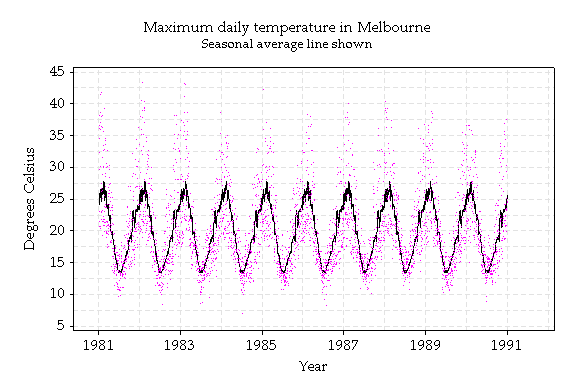
Does the maximum daily temperature behave the same way? If you really think about it you can see before looking at the graph that it doesn't.
Another way of displaying these patterns is with 'boxplots'.
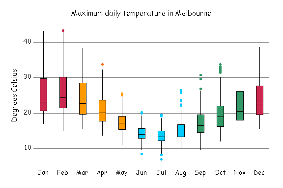
These are monthly boxplots of daily maximum temperatures. Each box contains the middle half of the values for that month. For instance, about a quarter of days in January are hotter than about 30 degrees, and a quarter are cooler than about 21 degrees. These boxplots show the same data as the boxplot graph in the upper right hand corner of the Statistical Consulting Centre webpages.
The data were obtained from Rob Hyndman's Time Series Data Library.
WHAT IS AREA = ΠR² FOR CLOVER?
In 1990, the second year students in Agriculture at The University of Melbourne measured several things about a sample of 140 3-leafed clovers, including:
Midrib, the length of the spine running through the middle leaf, in cm, and
Area, the actual area of the entire clover (all three leaves), in cm².

How can the midrib length be used to predict the area of the clover?
First, here's a graph of area versus midrib:
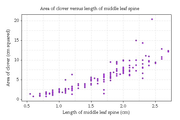
Clovers with longer midribs have greater area. However, the relationship is curved, and the accuracy of prediction is worse for larger clovers. This pattern of increasing variation for larger values is common and an often be corrected by taking logarithms of the data, and analysing the results.
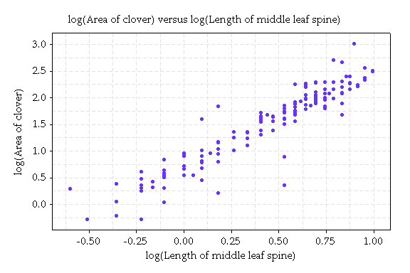
The relation is quite linear. The inaccuracy of a straight line prediction no longer increases as it did in the original plot.
We can consider a straight line model for these data. More formally this is called a linear regression model. It takes the form: log(area) = a + b log(m) + error, where m is the midrib. The error describes the unpredictable or random variation from the line.
Here's the graph with the line.
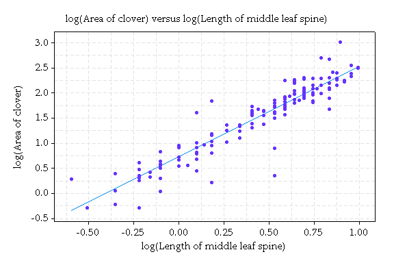
Using a statistics package, we can estimate a and b. This gives the equation log(area) = .73 + 1.80 x log(m).
Transforming this relation back to the original variables (by reversing the logarithms) gives the prediction curve shown here:
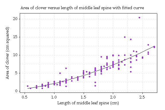
The equation of this curve is: area = 2.08 x m1.8. We can rewrite this equation in terms of half of the midrib, called r. The equation becomes: area = 7.24 x r1.8. Remember the area is for three leaves, so we could write: area = 3 × 2.41 x r1.8.
Now for circles, the relation between area and radius is area = π x r2. The analogue for clovers is Area = 3 × 2.41 x r1.8
The power of the radius, 1.8, is not too different from 2, but the area increases a bit more slowly with radius for leaves than for circles.
Conclusion: The relation Area = 3 × 2.41 r1.8 is the analogue for these clovers to Area = πr2; for circles.
TALL PARENTS HAVE SHORTER CHILDREN, ON AVERAGE.
Sir Francis Galton (1822-1911) was the first to note that tall parents have
shorter children, on average.

His protege and colleague Karl Pearson (1857-1936) studied 1078 father-and-son pairs. He found that the fathers' average height was 68 inches and the sons' average 69 inches. However, the tall fathers (say, of height 72 inches, within the vertical strip on the graph below) had sons averaging 71 inches. They were one inch shorter, on average. On the other hand, the sons of short fathers (say, 64 inches in height) averaged 67 inches in height.
They were three inches taller, on average.
Galton termed this phenomenon "regression to mediocrity".
Ever since, the method of studying how one variable relates to another variable has been called regression analysis.
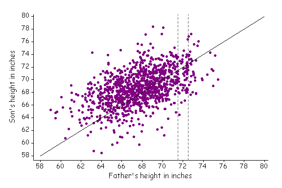
The figure shows the heights of 1078 fathers and their sons at maturity. Each father is paired with only one of his sons. Fathers and sons of equal height lie along the solid line on the figure (x=y).
The figure is based on a graph from Statistics by Freedman, Pisani, Purves and Adhikari.
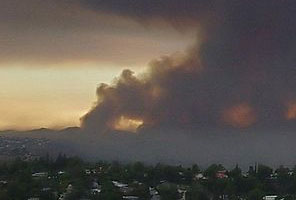
FIRE-FIGHTERS CAUSE DAMAGE?!
Statistics of the amount of damage caused in house fires show that the larger the number of fire-fighters attending the scene, the worse the damage!

What do you think the reason is?
This is an example of what is called Simpson's Paradox. The apparent association is due to the omission of some important information. In the example of house fires, the size of the fire needs to be taken into account—more fire-fighters are sent to larger fires and the larger the fires, the worse the damage.
In many situations, the explanation for some apparent association cannot be identified easily. One example is the association between smoking and lung cancer. It has been argued that the apparent association between the two may be due to some genetic factor that predisposes people both to nicotine addiction and lung cancer.

If this is true, then smoking cannot be blamed for causing cancer. It was only after considerable research, with the aid of statistical methods, that it is now generally accepted that smoking is a contributory cause of lung cancer.
GERMAN TANKS IN WW2
In World War 2, the Allies used statistical methods to estimate German military strengths.
For example, to determine how many tanks the Germans had in 1943, the Allied Economic Warfare Division in London analysed the serial numbers on captured German tanks. In the simplest form, each serial number gives information—a serial number of, say, 117 means there were at least that many tanks manufactured.
Using similar but more sophisticated statistical methods, statisticians working for the Allies made the estimates shown in the table below. Allied intelligence agencies were also making estimates based on other information, and these are shown too. All data are monthly production values.
Estimates against records for the number of German tanks in WW2
| Date of estimate | statistical estimate | Intelligence estimate | German record |
|---|---|---|---|
| June 1940 | 169 | 1000 | 122 |
| June 1941 | 244 | 1550 | 271 |
| August 1942 | 327 | 1550 | 342 |
In this case the actual numbers became known from the Speer Ministry after the German surrender, so the true values are known and shown in the table too. The statistical methods gave much better results.
Reference:
Ruggles, R., and Brodie H. (1947) An empirical intelligence in World War 2. Journal of the American Statistical Association , 42 :72-91.