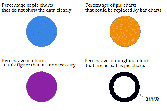
Why you shouldn’t use pie charts
Pies and doughnuts are off the menu!
Pie charts and their close cousins, doughnut charts, are part of our staple diet of graphs of data – we find them on blogs, in newspapers, in textbooks and in presentations at work. But one way to annoy your unassuming, mild-mannered local statistician is to ask for a pie chart (or worse, a Krispy Kreme).
What is the problem with pies and doughnuts?
Graphs of data should tell us about the quantities involved and help us to make accurate comparisons between these quantities. The quantities in each category should be easy to estimate and the category labels should be clear.
Pies and doughnuts fail because:
- Quantity is represented by slices; humans aren’t particularly good at estimating quantity from angles, which is the skill needed.
- Matching the labels and the slices can be hard work.
- Small percentages (which might be important) are tricky to show.
Four sure signs that your pie or doughnut is failing
- You need to add the percentage to every slice.
- You need to directly label every slice.
- You have run out of colours for the slices.
- You decide to explode the chart to solve your first three problems.
A bit like this:
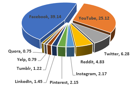
(Market share of visits to social network sites in November, 2017)
Here's an alternative graph of the same data:
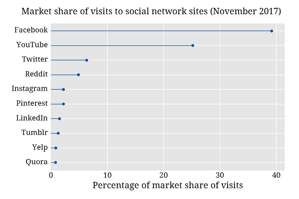
Some people might say this graph is boring, but as Edward Tufte warns in his book Envisioning information:
"Cosmetic decoration, which frequently distorts the data, will never salvage an underlying lack of content."
Why is the second chart so much better?
- We can estimate the quantities – the gridlines are helpful here.
- We can immediately see the order of the sites.
- We can accurately compare the different sites.
The bottom line