Five principles of good graphs
You may have met five principles for creating good graphs in a course or seminar given by the Statistical Consulting Centre.
You can also read about them in this article:
Here are the principles and some tips for creating graphs that are consistent with them.
Show the data clearly
Showing the data clearly includes ensuring the data points can be seen but also providing meaningful text on the graph itself. Tips include:
- Check the data points plotted can be detected, and are not covered up or obscured.
- Don't assume the viewer is a mind-reader ... label titles and axes clearly and accurately.
- Maintain constant measurement scales and avoid distortions.
Use simplicity in design of the graph
A graph with a simple design strives for a clean, uncluttered look. Simplicity in design does not mean simplicity in data however; well-designed graphs can represent rich data.
- Avoid distortions, shading, perspective, volume, unnecessary colour, decoration or pictograms, and 3D.
Use alignment on a common scale
Good graphs support accurate estimation of the quantities represented. To estimate quantities, the reader needs to understand the scale used to represent quantity on the graph.
- Use a single linear scale whenever possible.
- Use a common scale if a single scale is not possible, for example, when using panels.
- Avoid pie charts, doughnut charts, stacked bar charts.
- Add gridlines to assist with accurate comparison and estimation; a grey background with white gridlines is often effective.

- Consider transposing a figure to find the easiest way to display the common scale.
The 2016 popular vote in the US Presidential election provides a simple example of a transposition:
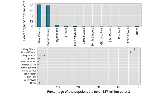
Transposition makes the labels easier to read here, and provides more landscape for the quantitative axis, making the quantities easier to estimate.
Keep the visual encoding transparent
Graphs use visual encoding to represent data. Readers need to decode the graph. This works best when the decoding task is made easy by astute choices in the design of the graph, making the visual encoding transparent and the decoding effortless. Here are some tips:
- Follow principles 1, 2 and 3!
- Use a common scale if a single scale is not possible.
- Consider how the ordering of elements affects decoding.
- Use colour and shading with meaning.
- Solve detection problems with
- panels
- open circles or small points
- jittering
Use standard forms that work
Accurate interpretation of graphs relies on a shared understanding of the definition of the graphical objects used. Using standard forms for standard needs supports more reliable interpretation of data visualisations.
- Adhere to the principles that define graphical objects.
- Use standard forms
- Dotplot
- Histogram
- Boxplot
- Time series plot
- Bar chart or dot chart
- Line plot of estimates
- Estimates as points, with confidence interval bars