Error bars on graphs
In many publications, you will see error bars around an estimate, such as a mean or a mean difference.
The length of the bars around the estimate might correspond to the standard deviation, standard error or margin of error.
The choice of bars to plot will depend on your purpose. Usually bars are provided to indicate the uncertainty in the estimate; in these cases, using the margin of error is appropriate. The margin of error is the half width of a (usually 95%) confidence interval. So bars showing the margin of error around the point estimate represent the confidence interval.
Here we consider some ways of plotting error bars. The example comes from a study of canine therapy in reducing patient anxiety in the emergency department. (Kline, J. A., Fisher, M. A., Pettit, K. L., Linville, C. T., & Beck, A. M. (2019). Controlled clinical trial of canine therapy versus usual care to reduce patient anxiety in the emergency department. PloS one, 14(1), e0209232.) The data are available from Dryad, and the analytic approach presented below is consistent with the approach of the study authors.
The outcome considered is patient-rated anxiety; it was measured at baseline and 30 minutes later. Patients randomly assigned to the canine therapy group were visited by a dog and its handler for 15 minutes post-baseline. A model was fitted that provided estimates of the mean anxiety in each group at baseline and 30 minutes later; 95% confidence intervals were also obtained. (Note that this is an illustrative analysis for the purpose of considering plotting error bars; more complex analysis is considered in a separate post.)
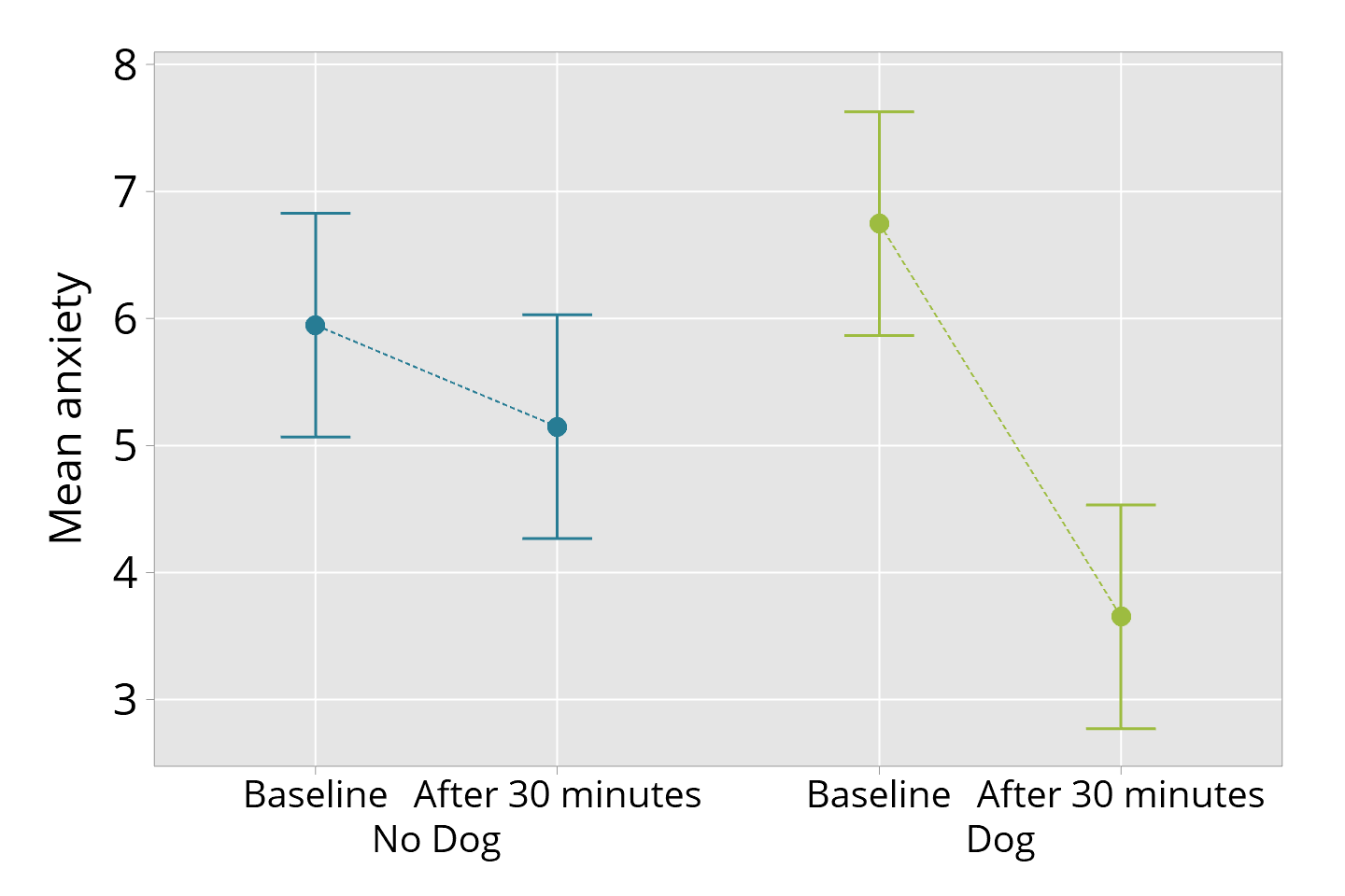
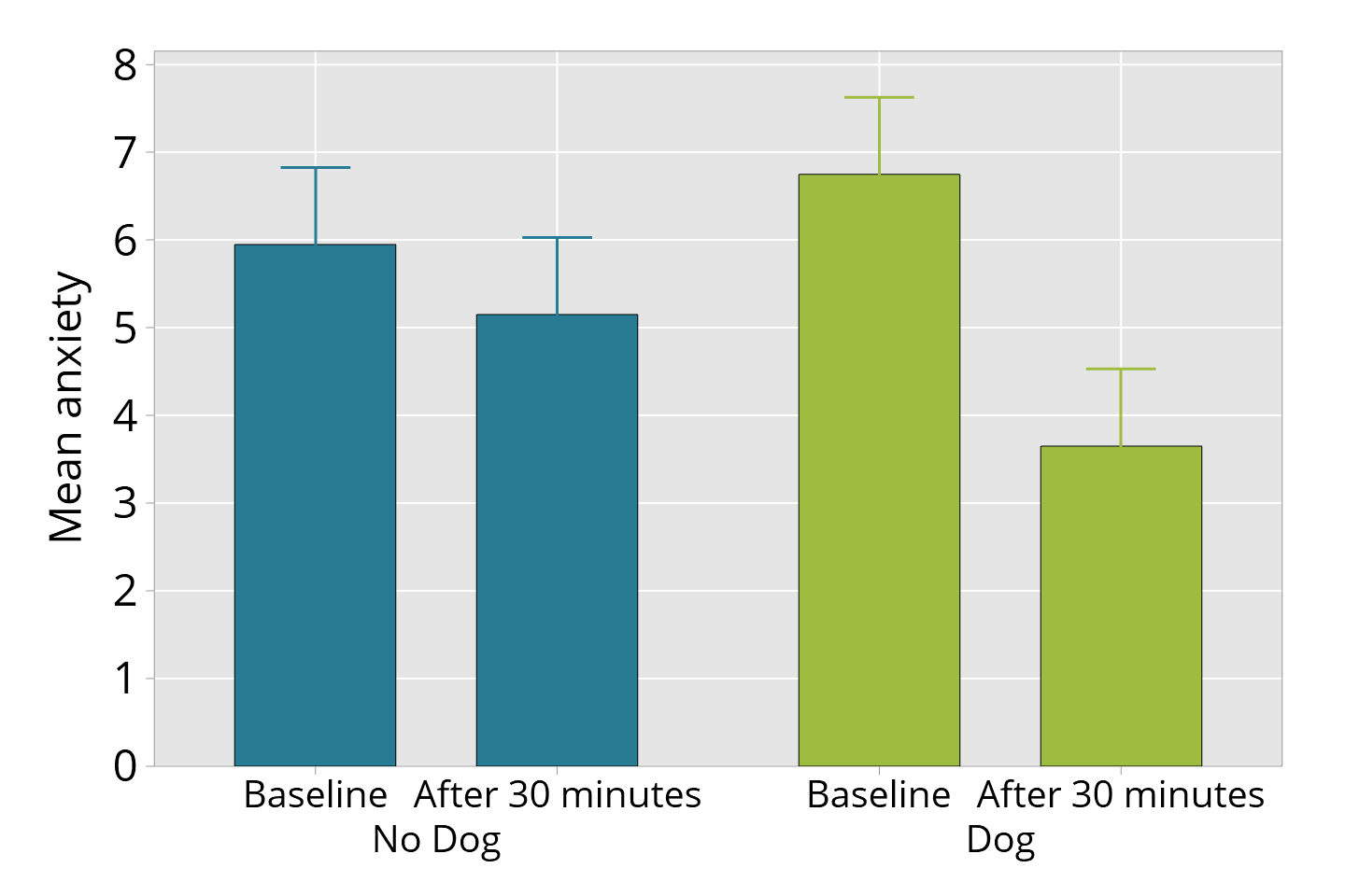
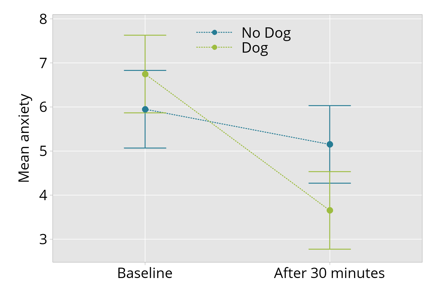
The figures below show different ways the estimates and confidence intervals might be plotted.
The first figure below is a useful way of showing the estimates and 95% confidence intervals clearly.

The following examples are less adequate, although these styles of graphs are not uncommon.
The next graph shows "errors bars on mean bars". There are several problems here. The confidence interval is not represented explicitly; rather the upper bound of the confidence interval can be seen, but the lower bound is not shown. This style of graph commonly uses a minimum value of zero, as shown in the example here. This is essentially an arbitrary choice, as the value of zero need not be relevant in the context of the measurements taken. But note the effect of setting the minimum to zero; it's potentially quite comforting. The error in this graph looks smaller than in the other graphs.

The next graph shows the estimates and 95% confidence intervals but there is a problem of detection - it is not easy to read the values off the graph - as the confidence interval bars overlap. This problem has a simple solution (shown in the first graph) but it is not used as often as it should be.
