Understanding boxplots
The power of boxplots
A boxplot is a visualisation of a numerical variable based on summary statistics.
Boxplots are most useful in making comparisons. For example:

The data are the number of votes for Hillary Clinton and Donald Trump in each of the US states in the 2016 US Presidential election.
The nuts and bolts
Boxplots are comprised of:
- a box with a line inside
- lines extending from the box, called whiskers
- points plotted outside the whiskers, called outliers
The line in the box is the median.
The ends of the box are either:
- the first and third quartiles, or
- Tukey’s hinges
Tukey invented the boxplot as an easy visualisation to construct by hand; he defined the hinges as easy to compute approximations to the quartiles.
In exploring data using boxplots, the distinction between the quartiles and the hinges is usually immaterial. Unless a data set is very small, you won’t notice the difference between the quartiles and the hinges.
The whiskers are:
- lines extending from the end of the box to a real value in the dataset
- of maximum length 1.5 times the length of the box
Outliers are:
- points plotted separately
- values beyond the whiskers
Consider now, just the votes for Trump in the 2016 Presidential election. The dotplot below the boxplot shows the raw data.

Note that the whiskers extend to real values in the data.
Sometimes people incorrectly think the length of the whiskers should always be exactly 1.5 times the length of the box. The maximum possible length of the whiskers is 1.5 times the length of the box. They are only ever that length if there is an observation in the data at exactly that value. Otherwise the whiskers extend to the value in the data furthest from the end of the box, but within 1.5 times the box length.
The distinction between the potential whisker length and the actual whisker length is shown below.

How to spot a fake boxplot
You can find explanations of boxplots that are poorly considered, and usually that means that they are constructed without using real data.
This is not a boxplot …
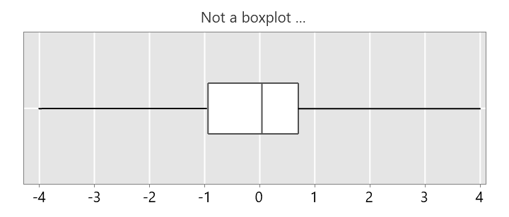
… because the whiskers are much longer than 1.5 times the box length.
This is not a boxplot …
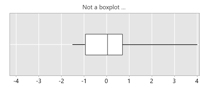
… because one of the whiskers is much longer than 1.5 times the box length.
This is not a boxplot …
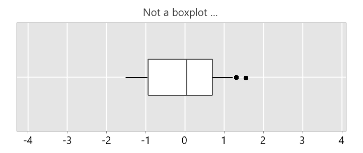
… because the right whisker isn’t long enough, there should not be any outliers here.
This is not a boxplot …
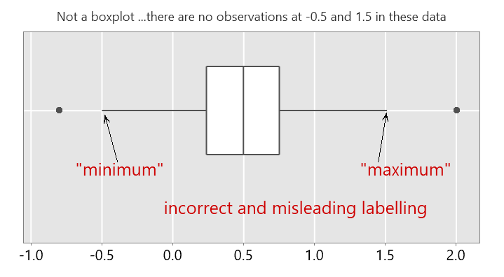
… because the whiskers are 1.5 times the box length, but we are told there are no observations at those endpoints. In addition, the ends of the whiskers are labelled “minimum” and “maximum”. This is confusing, they are not the minimum and maximum values in the data.
You can find an example of such a confusing explanation here. Note that boxplots are not used in practice to represent a statistical model or probability density function. They are a visualisation of observed data.