Tricks for plotting confidence intervals in Minitab
Minitab can provide confidence intervals for means, for example, via the Graphs > Interval Plot menu.
Confidence intervals for pairwise comparisons of means from a General Linear Model can be obtained via Stat > ANOVA > General Linear Model > Comparisons. This requires you to first fit a model.
You can plot confidence intervals for other estimates, perhaps from more complex models, in Minitab, but this involves some tricks. By 'trick', we mean exploiting what is possible in Minitab, without it being a direct Minitab feature. These are described below.
Symmetric confidence intervals
If your confidence intervals are symmetric, meaning that the form is (point estimate +/- margin of error), follow the example here.
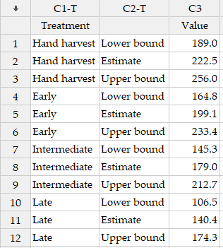
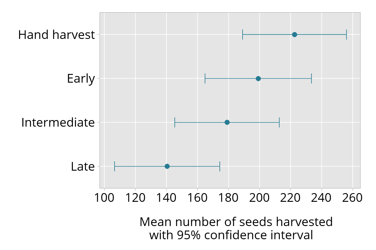
The data are from a study of ways of harvesting seeds from native lilies. A model was fitted to provide estimates of the mean number of seeds harvested in each of four treatment conditions; this model adjusted for covariates. To plot the confidence intervals of interest, the estimates and confidence interval bounds are entered into a Minitab worksheet, as shown below. The first column is the treatment group, the second column indicates which value is included (this helps with checking), and the third column provides the numerical value.
Use Graph > Interval Plot > One Y With Groups.
For the Graph variables enter Value; for the Categorical variables for grouping, enter Treatment. Then click OK.
The graph you get should look something like this, but it is not correct:
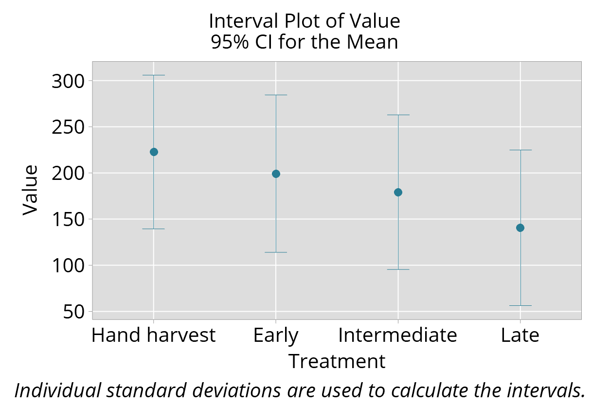
The bounds are incorrect, as Minitab uses the three values in each treatment as three separate observations.
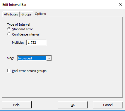
To correct this, open the graph to edit it. Then click on the bars. Under the Options, change the Type of Interval to Standard error, and the Multiple to 1.732, as shown below. Then click OK.
Check that the bounds now correspond to their correct values.
You should remove the label that says "Individual standard deviations are used to calculate the intervals." That's not true; we are using this functionality to produce a specialised graph.
If you want to know why this works, here's the explanation.
See my final version of this graph below, where other improvements have also been made:
Asymmetric confidence intervals
Confidence intervals can be asymmetric, meaning that the estimate does not fall in the centre of the confidence interval. Confidence intervals for correlation coefficients, for example, need not be symmetric.
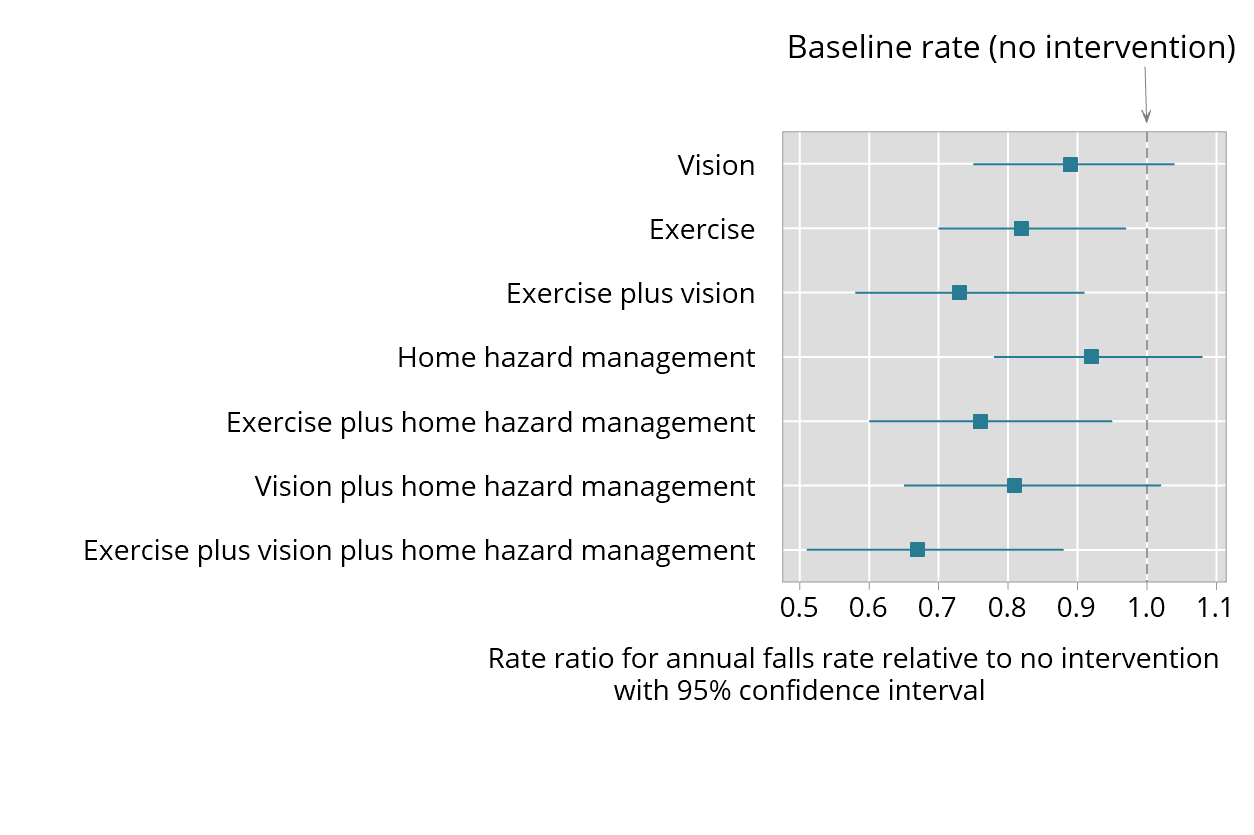
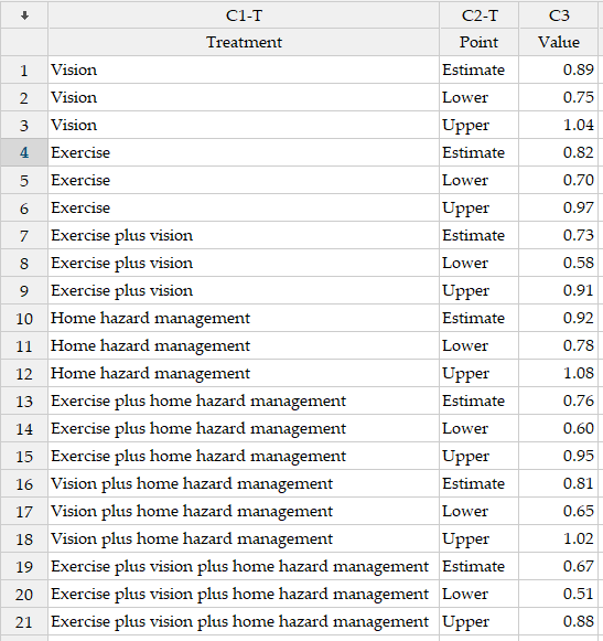
The data considered here are from a trial of falls prevention in the elderly. The results of this study were published in the British Medical Journal, and includes a table of the rate ratios of annual falls in each of seven groups, compared with a no intervention group. 95% confidence intervals were also provided. The estimates and confidence interval bounds as entered in Minitab are shown below:
The "trick" to use in Minitab is different from that for symmetric confidence intervals.
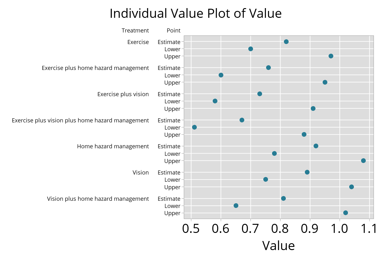
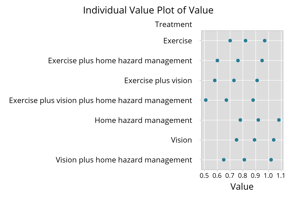
Use Graph > Individual Value Plots > One Y With Groups. For the Graph variables enter Value; for the Categorical variables for grouping, enter Treatment then Point, in that order.
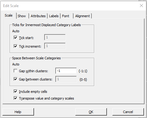
Before you click OK, click on Scale and check the box to Transpose values and category scales. Then click OK. Your graph should look something like the graph below.
There are a few edits needed to the graph to get it in the right format. Click to edit the graph.
First we want to align the three values for each treatment on a single line, and to remove the labels for the variable called "Point".
Here are the steps:
- Double click on the Y-axis to see the Edit Scale options. On the Scale tab, Untick Gap within clusters, and than set the value to -1, like this:
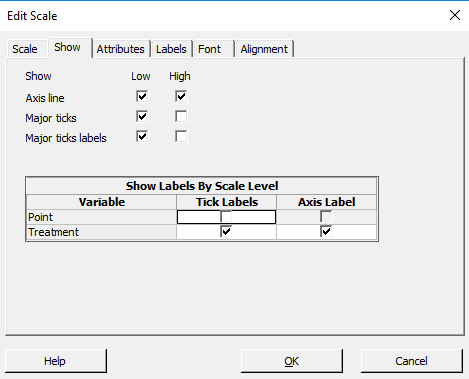
- Next go to the tab labelled Show. Untick the Tick Labels and Axis Label for the Variable "Point", like this:
- Click OK. The estimate and ends of the confidence interval should be aligned with the treatment labels, like this:
- Next right click on the graph and go to Add > Data display. Tick Mean connect line, than Click OK.
- This will connect all the values. You next need to click on the Mean connect line to edit it.
- Go to the Groups tab, and enter "Treatment" in the box for Assign attributes by categorical variables. Click OK.
- Now you should have a line joining the three values for each confidence interval for each treatment.
- You may wish to further refine the graph. Here's my final version: